Best Facebook Ads Examples
- Best Facebook Ad Examples For E-commerce
- Good Facebook Ad Examples For Media
- Best Facebook Ad Examples For SAAS
- New Facebook Ad Examples For Consumer Brands
- Examples of Facebook Ads By Format Focus
- The Best Facebook Video Ad Examples
- Facebook Lead Ads examples
- The Best Facebook Carousel Ad Examples
- Facebook Slideshow Ads examples
- Facebook Offer Ads examples
- Facebook Messenger Ads examples
- Facebook Stories Ads Examples
Facebook ad examples frequently give the impression that you have two choices. You can either try to develop something from scratch or model your commercials after a popular brand.
Our opinion is that you should observe industry best practices and what your competitors are doing while, of course, adding your own unique touch. The finest ads combine these crucial suggestions. Contact us if you’re interested in receiving your customized Facebook ads plan. With smart Facebook ad examples, we have a ton of experience.
Best Facebook Ad Examples For E-commerce
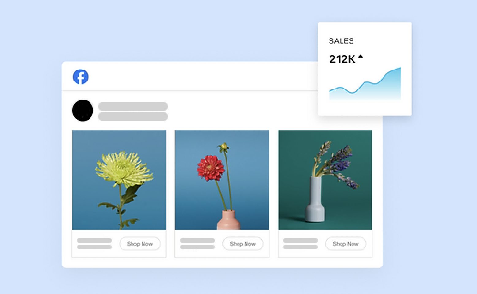
The top online stores high-quality, professionally taken photographs are used in competitive Facebook ad examples to stand out in the newsfeed. They are lovely depictions of your product in actual settings rather than generic “stock” photos that appear artificial and overly staged. There’s something about a person’s kind face that draws our attention. It’s intimate, moving, and enables the customer to picture themselves using your goods.
In the world of eCommerce, brand consistency is incredibly undervalued. Create a consistent experience for your prospects at each touchpoint if you are utilizing a variety of channels to engage them, such as banner ads, search ads, blog articles, landing sites, contests, and even offline marketing.
Good Facebook Ad Examples For Media
Businesses can gain from investing in ads ecosystem when combined with clever images, clear language, obvious calls-to-action, and attractive pricing. Here is one excellent example from media entrepreneurs who are willing to share their experiences.
Dunkin’
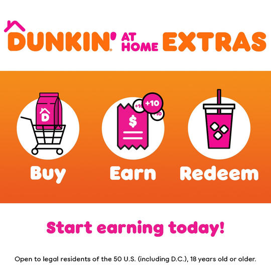
There are fun Facebook ad examples like Dunkin’s ad. While the majority of businesses concentrate on the top of the funnel, I rarely observe ads concentrating on keeping their recently gained clients. This was one of the factors that led to the inclusion of this ad.
By providing an additional incentive to individuals who are currently purchasing their goods in stores, it converts one-time customers into repeat buyers. It provides customers with an additional (and more practical) way to buy its products. They can guarantee that their clients retain coming back for more and develop into devoted product advocates by capturing this portion of the Facebook ad funnel.
Best Facebook Ad Examples For SAAS
This Slack Facebook ad is entertaining, catchy, and quite pertinent. There isn’t much writing, but what is there makes good points and emphasizes the phrases “simpler,” “pleasant,” and “productive.” The hands-on emojis make the picture amusing and stand out.
This dynamic ads Facebook examples from MailChimp because it is so unique and unusual. There is nothing better than a brief film (6 seconds) to immediately grab our attention. The message, Automate your Marketing with MailChimp, is more than sufficient; the brilliant movie handles the rest!
This Facebook ad is very direct about “getting their hands dirty.” Everyone would adore making their passion their business. A happier and pain-free existence is made possible by a career that you enjoy. The call to action here, “Try Shopify for Free,” is what makes or breaks this bargain for us.
In this article we are going to discuss the best examples of Facebook ads for SaaS marketing.
New Facebook Ad Examples For Consumer Brands
A Nike commercial stays true to its objective by using top-notch action shots of pro basketball players to boost brand recognition, attract new clients, and boost sales.
This is the kind of ad that causes sports enthusiasts to pause their Facebook news feed and focus on it. Action-packed scenes, elite athletes, and snappy messaging appear to hit the sweet spot for raising Facebook brand awareness in consumers’ minds and boosting purchases.
You only need a figure in a kitchen flipping vegetables in a skillet to attract users’ attention. Spotify creates an occasion-based demand to purchase their product in this example of an advertisement by using repeating animation, vibrant colors, and clear wording.
For Facebook users to move farther down the marketing funnel, it is crucial to explain what they should do after seeing an advertisement. It doesn’t get much stronger than “Listen free.”
Examples of Facebook Ads By Format Focus
Each section of the ad content has a unique purpose and aids in clarifying and reinforcing your product or the ad’s main theme. There are many of them such as Black Friday Facebook ad campaign examples, Real Estate Facebook ad examples, or Dental Facebook ad examples.
There are several critical items to cross off your checklist while writing ad copy:
- Does this ad speak to my audience in their terms and language?
- Does this ad make the current offer clear?
- Does this ad instruct the viewer on how to proceed?
So, let’s dive into it!
Facebook Image Ads examples
Photo or image ads, sometimes known as “picture ads,” are a quick and easy approach to increase brand recognition and engagement. These Facebook ad creatives are effective advertising examples.
1. Airtable
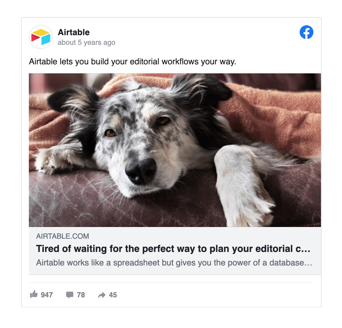
Airtable engages viewers with a question in just 21 words while summarizing its key value proposition (a platform for creating flexible editorial workflows). If you click on this ad, you’ll be directed to a landing page with additional information about the product and its benefits. Even the most inexperienced brands can employ this tried-and-true web marketing tactic. It serves as a helpful reminder that your ad doesn’t have to tell everything.
2. Funnel
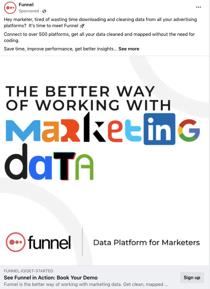
The caption of the ad is specifically designed for the target market. The target audience is mentioned in the opening of the copy. The ad highlights the problems that its target population frequently encounters (“downloading and cleansing data from all your advertising networks”). The picture is original and imaginative; it makes use of pieces from well-known brands to spell out the USP while also highlighting the integrations that Funnel supports.
3. Squarespace
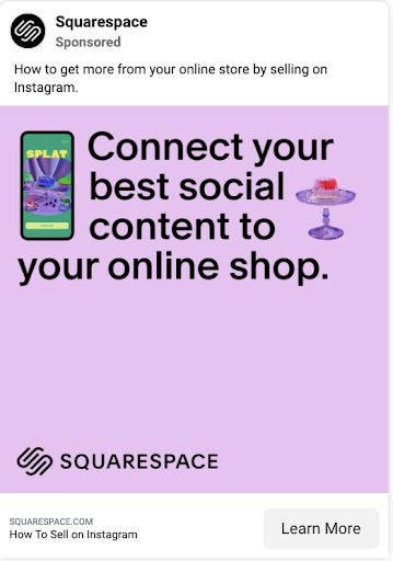
It might not seem like a good idea to use text-only image ads in your Facebook campaigns at first, but companies like Squarespace are testing this strategy.
Use a Canva template to quickly produce this kind of ad, then use Ads Manager’s a/b testing feature to find the headlines that work the best for your target demographic. To make it more exciting, experiment with strong fonts, emojis, and eye-catching colors.
Being unique can help you stand out in a crowded market when hundreds of businesses are competing for consumers’ attention. Squarespace uses their USP to the fullest extent possible to produce an original ad. The content of the ad clearly invites you to integrate Squarespace with your online store. Nothing is more straightforward than that.
The Best Facebook Video Ad Examples
85% of Facebook video views, according to a widely reported research, take place with the sound turned off. Therefore, from the perspective of accessibility, it makes sense to think about how your video will sound without audio. Several strategies can be used to make sure that your video makes sense without sound.
Using videos in Facebook ads is highly recommended. As we have explained the reasons fully in the article Reasons to use Facebook video ads. Let’s look at some Facebook ad examples.
1. Renault

Simple is sometimes the best. This social media ad example doesn’t require complex animation or high-end production because it only employs two pictures and a basic transition. Show before-and-after changes with this swipe transition. You can tease something in your ads that will be revealed in the design’s “after” layer.
2. Headspace
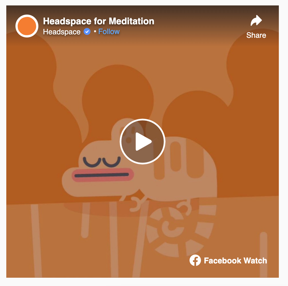
The majority of Facebook videos—around 85%—are viewed silently. The Headspace film makes use of text and illustrations to effectively convey its message in any setting and is also made available to viewers with hearing difficulties.
The video from Headspace may appear brief, but it’s not. Online users have limited attention spans, and when it comes to video, advertisers have just two seconds to grab viewers’ attention. The video’s message, which is also kept to a minimum, is unmistakable: subscribe to Headspace. Sometimes all you need is a clear call to action.
3. Coca-cola
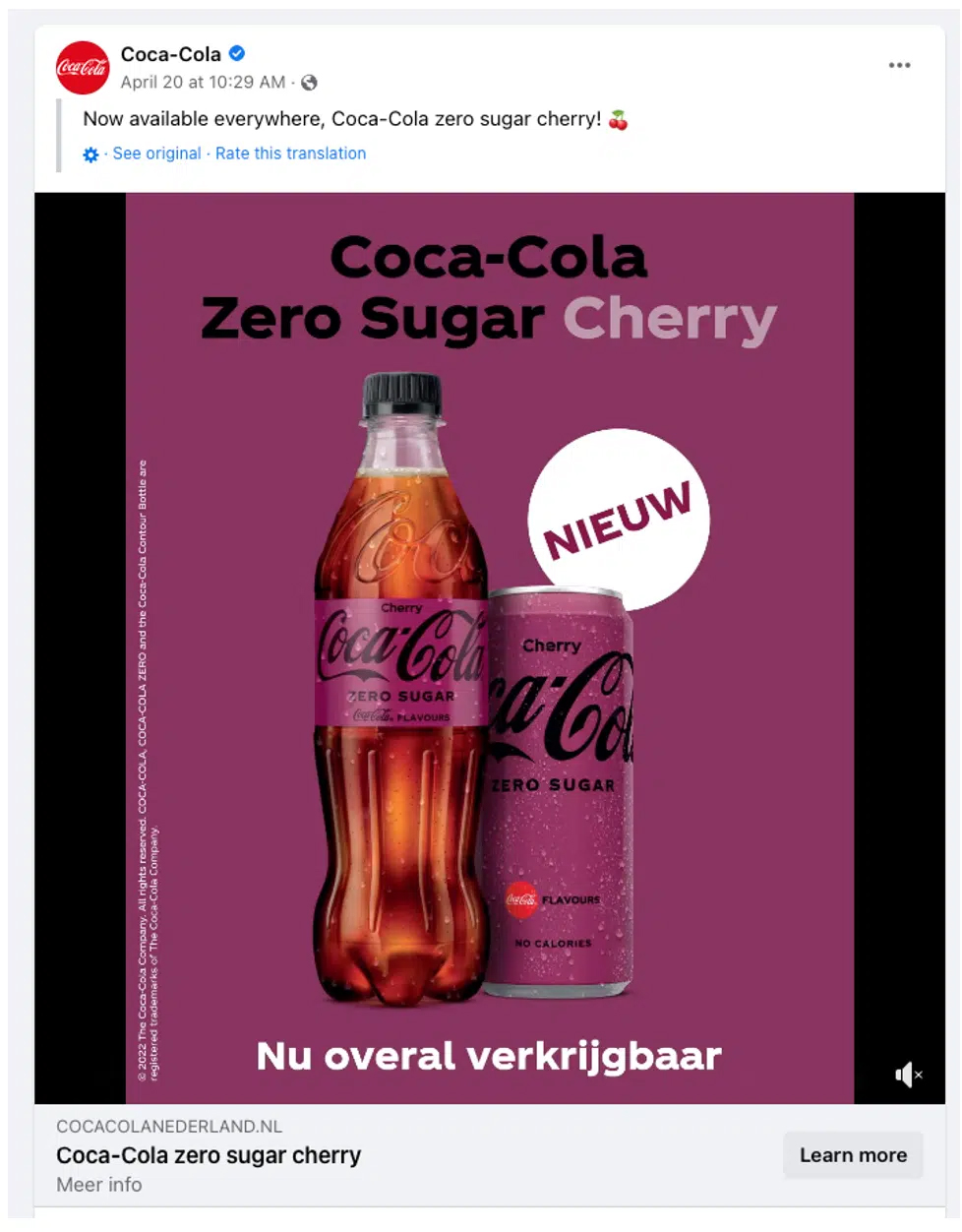
The color blocking in the ad is highly striking, and the “New” label serves as a sizable focal point that is pointed directly at the product.
The “Nieuw” (new) label describes the objective of the ad (and why someone would be targeted with it) – its goal is to emphasize a new product introduction rather than to increase brand recognition.
Read more: How to Run Facebook Traffic Ads?
Facebook Lead Ads examples
Advertisers can gather data about prospects straight from mobile ads by using lead ads. Instead of directing traffic to a landing page where users must manually fill out a form and press submit, they click on the ad, whereupon their information (name and email) is pre-populated, and then they click the submit button. on the Facebook platform, all together. These are the successful Facebook ads to generate leads. Let’s look at some of the successful Facebook ad examples for lead ads.
1. Sendinblue
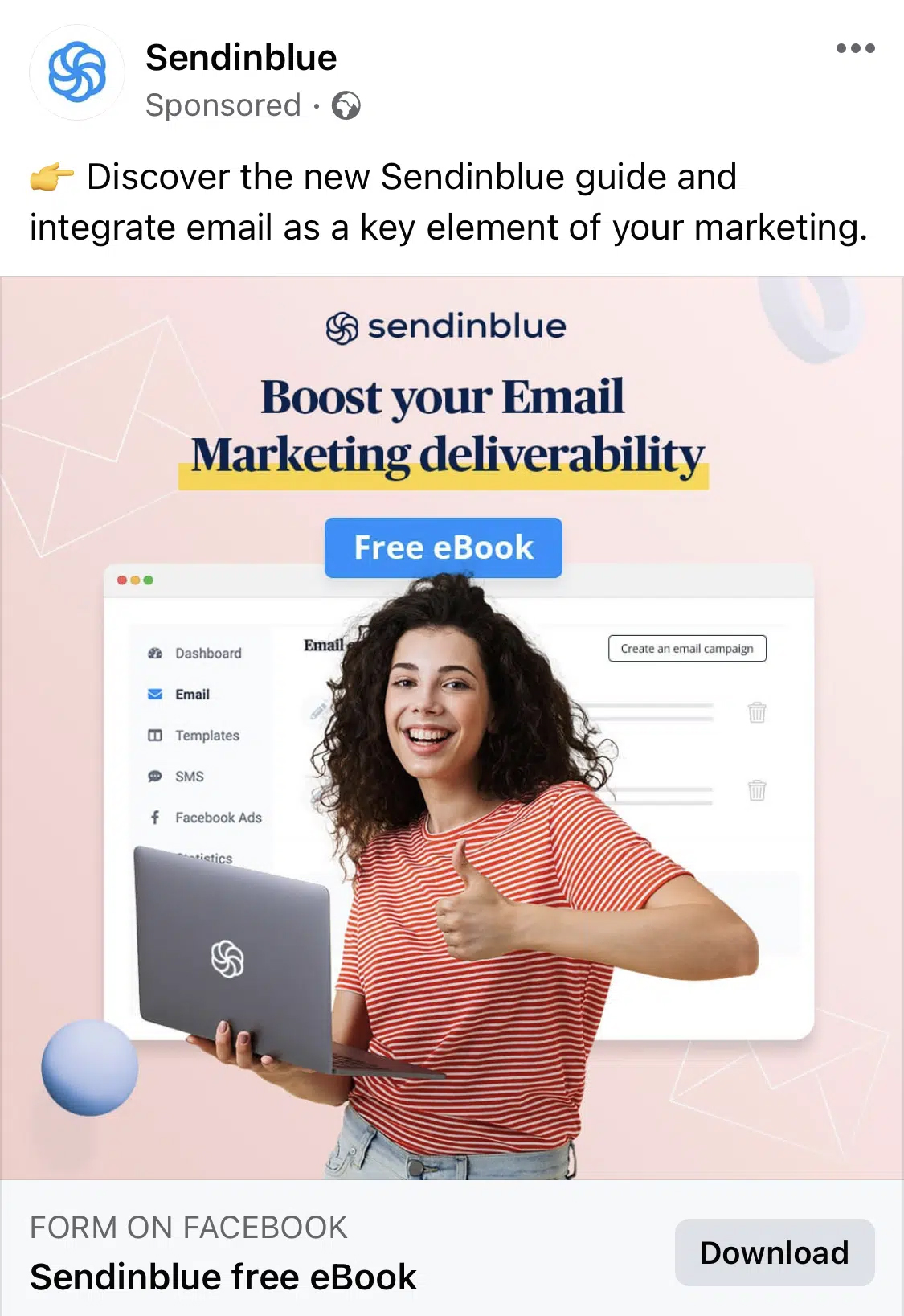
The design makes the “Free eBook” value proposition stand out because the accent color is in stark contrast to the rest of the picture. The advertisement caption is succinct and fits “above the fold.” The logo, the hook (“Boost your Email Marketing deliverability”), and the value proposition (“Free eBook”) all serve a specific role in the design.
2. Digital Marketer
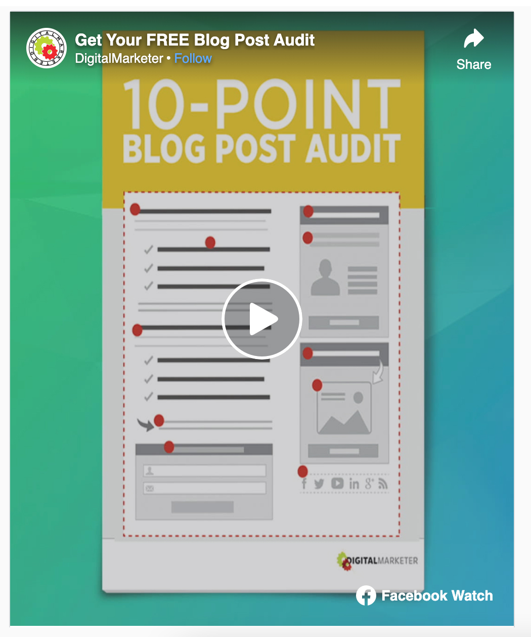
This ad grabs your attention. Check This Out at the beginning in large, strong letters allows Digital Marketer to grab the audience’s attention in the first three seconds. It clearly has a value proposition. What the user will obtain and the advantages of the download are very clearly stated in the content.
3. Design Pickle
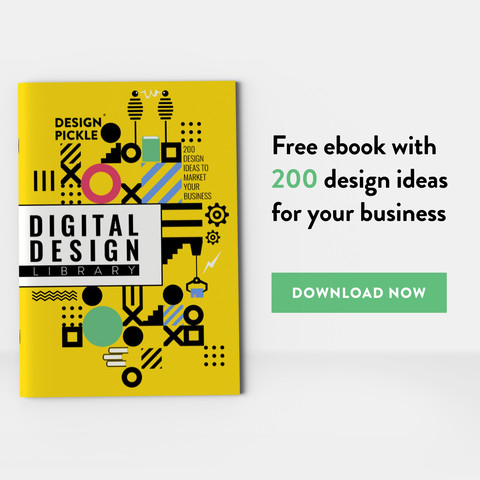
The cost of completing Design Pickle’s lead ad form. You provide them with certain information, and they return the favor by providing you with a guide that can be downloaded. It has a very concise form. Lead ad forms allow brands to ask up to 15 questions, but Design Pickle heeds Facebook’s guidelines and restricts the number of questions it asks. All that is required is choosing a response from a list of options as the email and name boxes have already been filled in.
The Best Facebook Carousel Ad Examples
Keep in mind these four tips to increase click through rates and brand recognition if you’re new to using carousels or want to improve: Create a showcase, impart a lesson, or tell a narrative. Use visuals that are crisp and well-designed. Text should be intriguing and brief. Here are the Facebook ad examples for carousel ads;
1. WATT
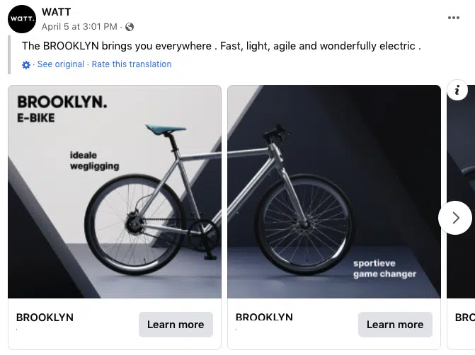
When the product image is divided over two (or more) slides, the visitor must navigate around the carousel to see the remaining portions. This can benefit all items or designs that occupy more horizontal space. WATT limits the amount of text on each slide to just one salient feature or advantage of the product. Short and to the point, the caption speaks to the audience’s demands when looking for a new bike.
2. Hello Fresh
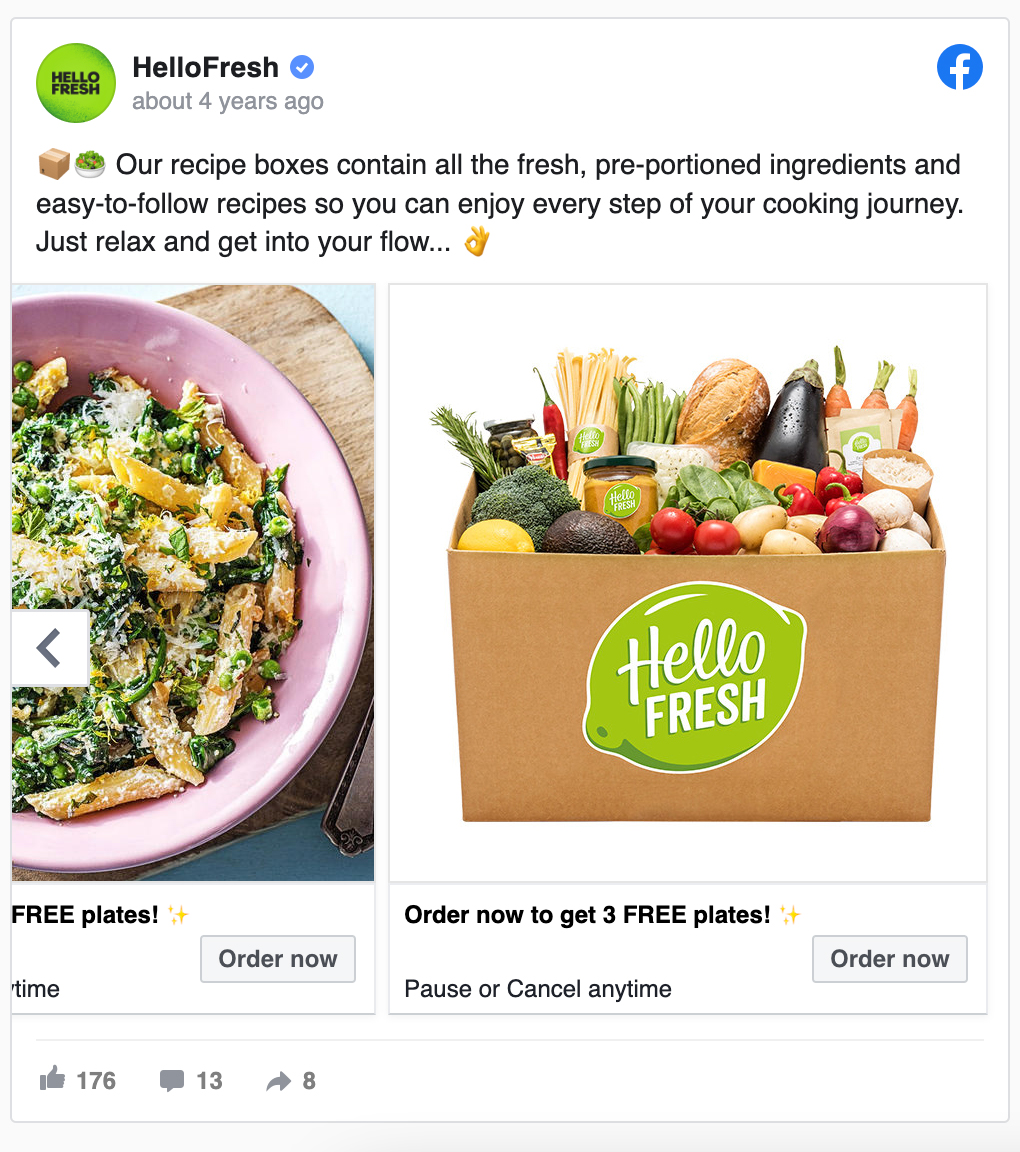
If variety is one of your brand’s selling points, the carousel format helps to highlight this. Taking full advantage, Hello Fresh offers four different dinners. Tempting food images are a great way to whet people’s appetites, and the carousel style does just that. High-quality photography that puts the goods front and center is a fantastic approach to pique appetites. Images in this ads show how the food kits function: Utilize simple recipes and a package of pre-portioned ingredients to create a variety of dinners.
3. Netflix
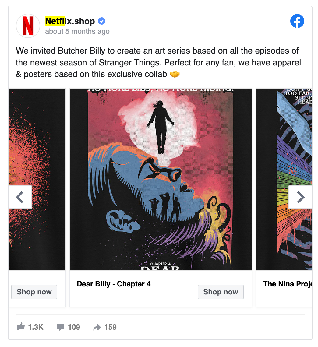
They are using paid content and tagging another creator. By attracting followers of the artist that others may already be following, this can broaden their audience. In their copy, they emphasize the rarity of their merchandise. They leveraged one of their main draws, the Stranger Things series, to grab people’s attention right away. The patterns are distinctive and appealing. Netflix is still somewhat of a competitor in the online retail space, even though it is likely to remain in the media company sector.
Facebook Slideshow Ads examples
Facebook slideshow ads are video-like advertisements that flawlessly express your story across platforms with motion, sound, and text. They play smoothly on all connection speeds since they load quickly. Slideshow ads may be made quickly and cheaply compared to some video advertising. Let’s see some Facebook ad examples.
1. Novus
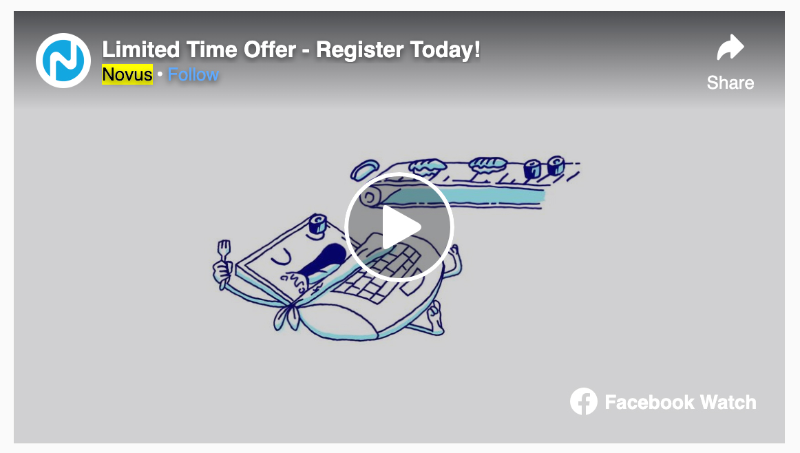
Slideshows with vintage animation are a clever technique to make photographs come to life. Animated illustrations can be a brilliant alternative for creators on a tight budget. Novus is aware that its clients are just as prone to gobble up data bytes as they are sushi bites. A small amount of double entendre is effective. The setting with the lowest bandwidth is the best area to promote high-quality internet. Novus makes sure it can reach potential consumers with high-quality material by employing the carousel style.
2. The New Yorker
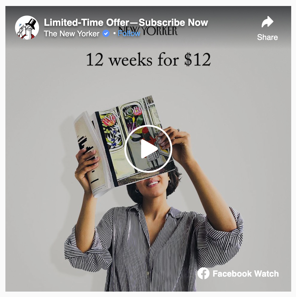
The offer from The New Yorker is straightforward. 12 people reading 12 different issues reinforces the offer of 12 weeks for $12. One who counts? Readers from New York, most likely. The magazine is 100% committed to being meticulous. You will receive the same twelve issues to read each week that you see in this slideshow. The repetition of people reading magazines could grow tiresome, but this ad turns the concept on its head—or, more precisely, in front of its heads.
Facebook Offer Ads examples
In the case of in-store offer ads, the deal will be added to the user’s Facebook offers bookmark and they will get a follow-up email that they can use later on their mobile device at the real store’s checkout. Prior to the offer’s expiration, a Facebook reminder will be sent to them.
1. Canva
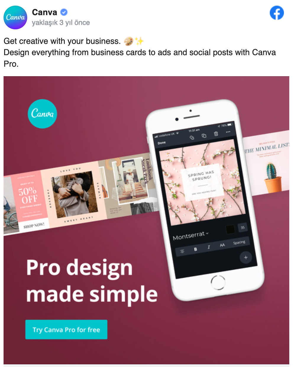
The copy specifically mentions the target market for this ad — ad owners who don’t have any design training but need a quick way to produce social media content. A risk-free trial is available. Offering a free trial is a terrific approach for SaaS organizations to attract signups. This is highlighted, making Canva’s offer compelling.
2. Cirque du Soleil
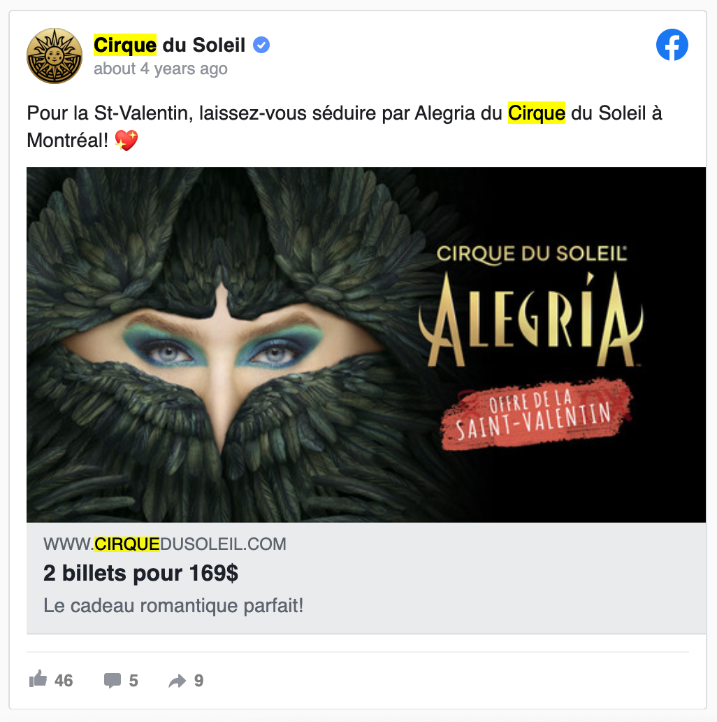
When a customer is looking to make a last-minute purchase, it can be the perfect time to reach them. By running ads on Valentine’s Day, this limited-time deal achieves that. Even if you don’t speak French, the deal in this ad is very obvious: two tickets for $169. Additionally, a two-for-one deal is appropriate for the celebration of love.
Facebook Messenger Ads examples
Placement is key with Messenger ads. The Facebook Messenger app has more mobile downloads than Facebook, so appearing in a user’s inbox can result in a wider audience.
The second sort of ad is a sponsored message. With these ads, you can send carefully written messages straight to a user’s inbox. It’s an excellent tool for encouraging strategic engagements and business-related actions while retaining users on the site and lowering bounce rates.
Facebook Stories Ads Examples
According to study findings, 62% of respondents are more interested in a company or product after viewing a story ad, more than half make online purchases, and 38% notify other people about items or services. Here are the Facebook ad examples for stories.
1. Tazo Tea
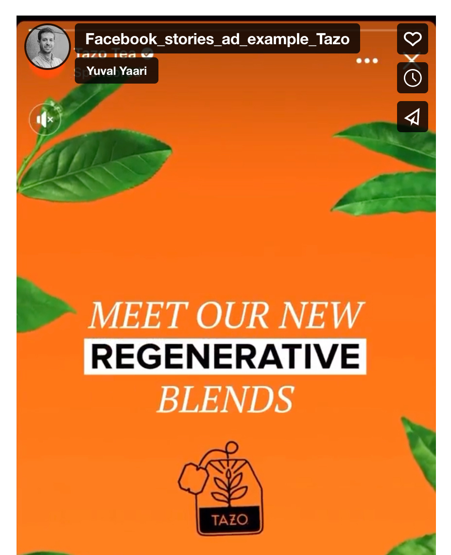
With this inventive Stories ad, Tazo’s design team has perfected the use of vibrant colors as a certain attention-getter. The final card reinforces all the items used with a nice wrap-up, the easy-to-read wording that gets to the message quickly, and the bright and attention-grabbing style.
2. Faire
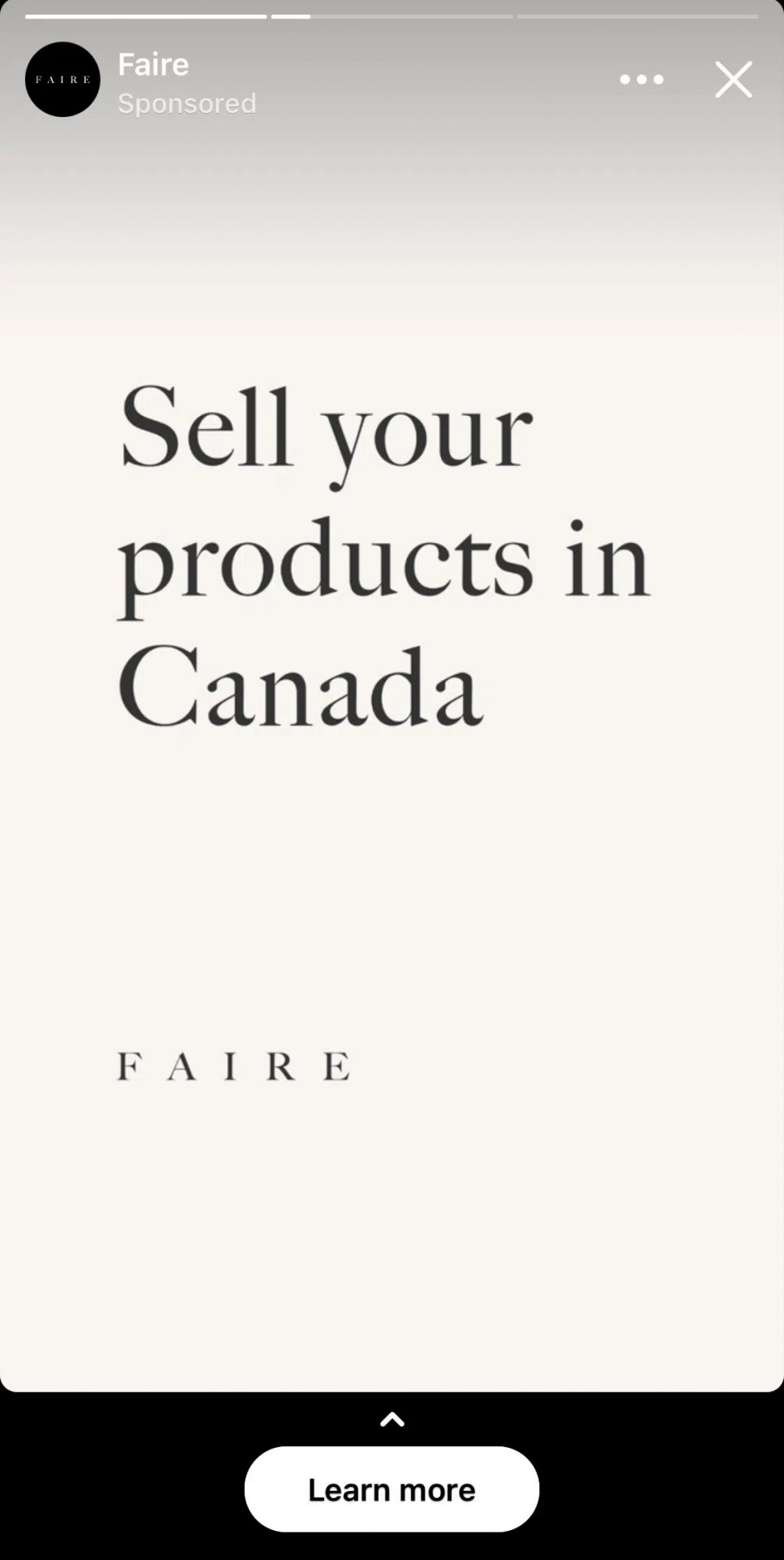
This Stories ad exploits how users explore the app (tapping through to the next one). The shipping information shifts from “US” to “Canada” to “U.K.” over the course of three frames, giving the animation a stop-motion appearance. The value proposition is simply spelled out with the logo in the ad’s minimalist style; there is no video, animation, or graphic.
Read more: About Facebook Ad size
Sum-up
The first step in attracting new consumers or effectively retargeting existing ones to increase brand loyalty is to expertly and visually market your goods and services on Facebook News Feed, where your target market is most likely to see them. So, while you test various ad formats and Facebook ad ideas, take some ideas from our list of good advertisement examples we’ve seen to keep your campaigns aesthetically striking and relevant to your target audience.
You can set them up with the aid of the Facebook Ads Manager platform using straightforward, step-by-step instructions, which will prevent you from feeling overwhelmed and give you the confidence to be creative. With WASK, you can optimize and manage your Facebook ads services much more easily!

What Is The Best Facebook Conversion Ad Example?
The average conversion rate for sponsored Facebook advertising across all industries, according to Facebook Ad benchmarks, is 9.21%. As a result, we may conclude that a “good” conversion rate for your Facebook ads should be 10% or higher.
How to Find Awesome Facebook Ad Examples For My Industry?
However, Facebook advertising are most effective in sectors like retail, e-commerce, real estate, consulting firms, investment firms, fitness, and healthcare.
What Are Some Examples Of Facebook Ads Based On Campaign Objective?
The six campaign objectives for consideration—traffic, engagement, video views, lead generation, messages, and app installs—optimize for a particular activity like link clicks or comments. Facebook will display your ads to users who are likely to take the action you’ve selected within your target audience.
What Ads Are Most Successful on Facebook?
Video ads. Regardless of your sector, the video ad format is possibly the most successful for Facebook PPC. To produce a film or a slideshow of photographs that will make up a video, Facebook offers its Creator Studio tool. Additionally, you can produce your own video and post it on Facebook.